

A social-networking platform and job-posting board for the entertainment industry.
My roles: UX Research, UX Design, UI Design
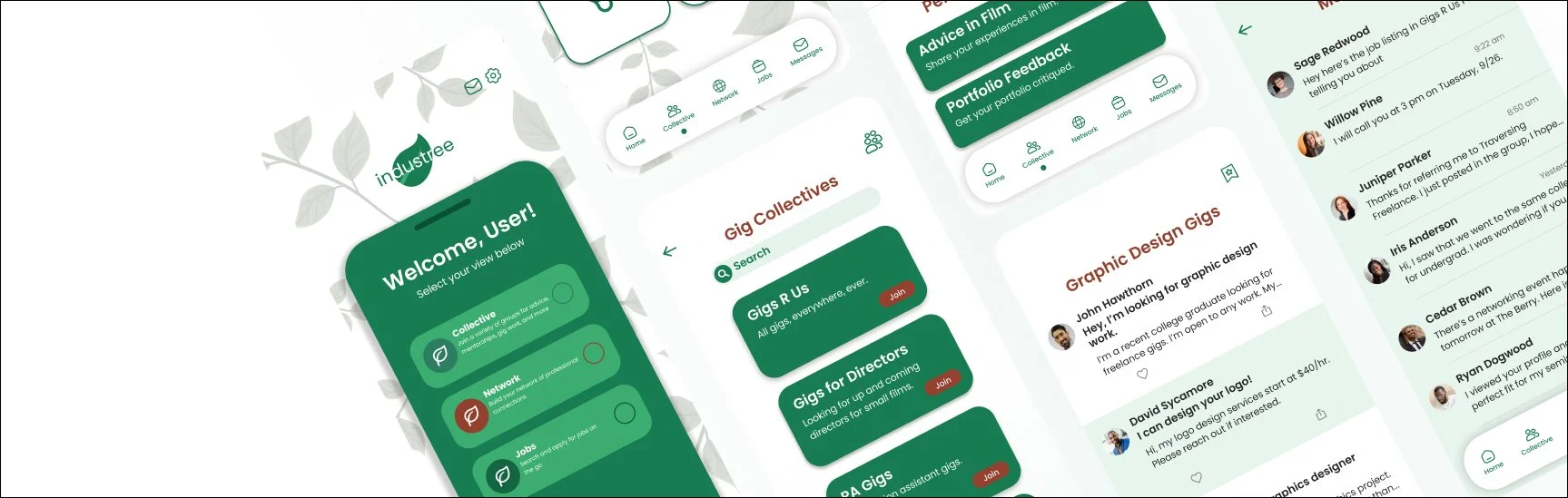
Industree is a platform dedicated to people who work in the entertainment industry. It functions as a job-posting board, social- networking platform and online community. Industree is meant to be a hub for users to find solutions to their career-related needs all in one place.

Overview
Our Mission
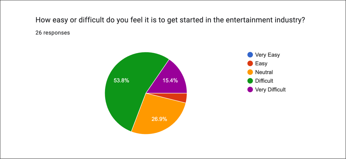
We originally conceptualized this app as a means to fill the gap in the entertainment industry. From past experiences in the industry, we have quickly learned it is not very friendly to beginners.
There's a major lack of a community network. Everything is based on knowing the right person or being in the right place at the right time.
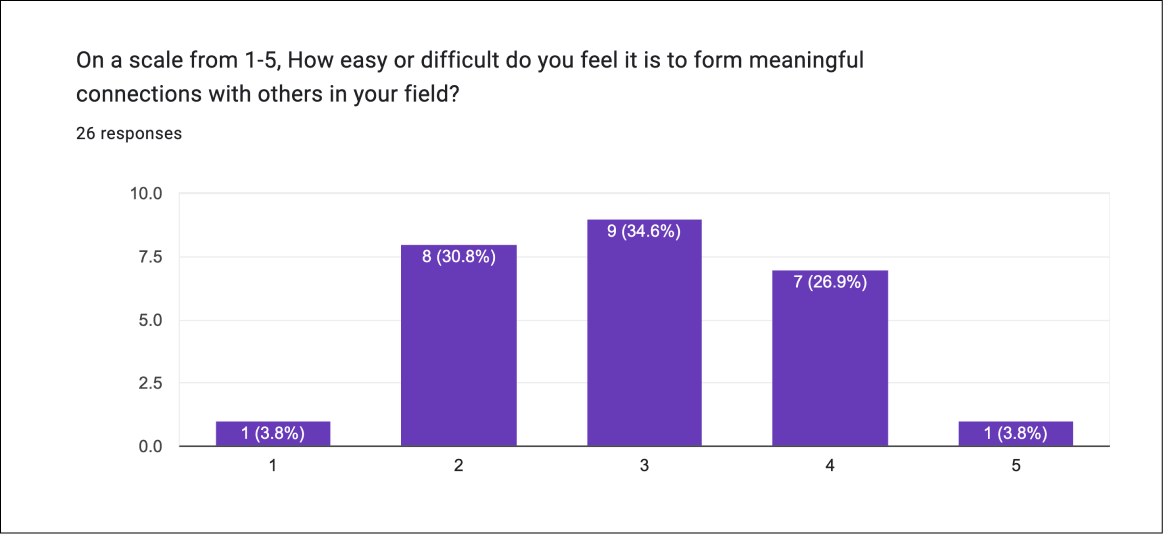
There is no real space dedicated to making friends with other industry professionals. And so, this is what we sought to create.
The Problem
No easy way to break in to the entertainment industry
There's no one place to manage and maintain the contacts people make
Generational gaps are difficult to bridge
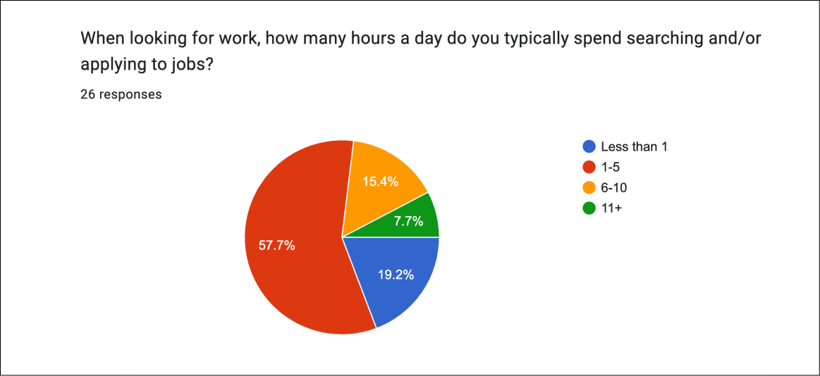
No simple way to seek jobs/gigs
Lack of community, every man for himself
The Solution
Provide an entry way into the entertainment industry
Create an interactive visual representation of the network itself
Connect veterans and newcomers in the same space
Supply a centralized place for sourcing jobs specific to this industry
Create an environment ideal for fostering community
User Research
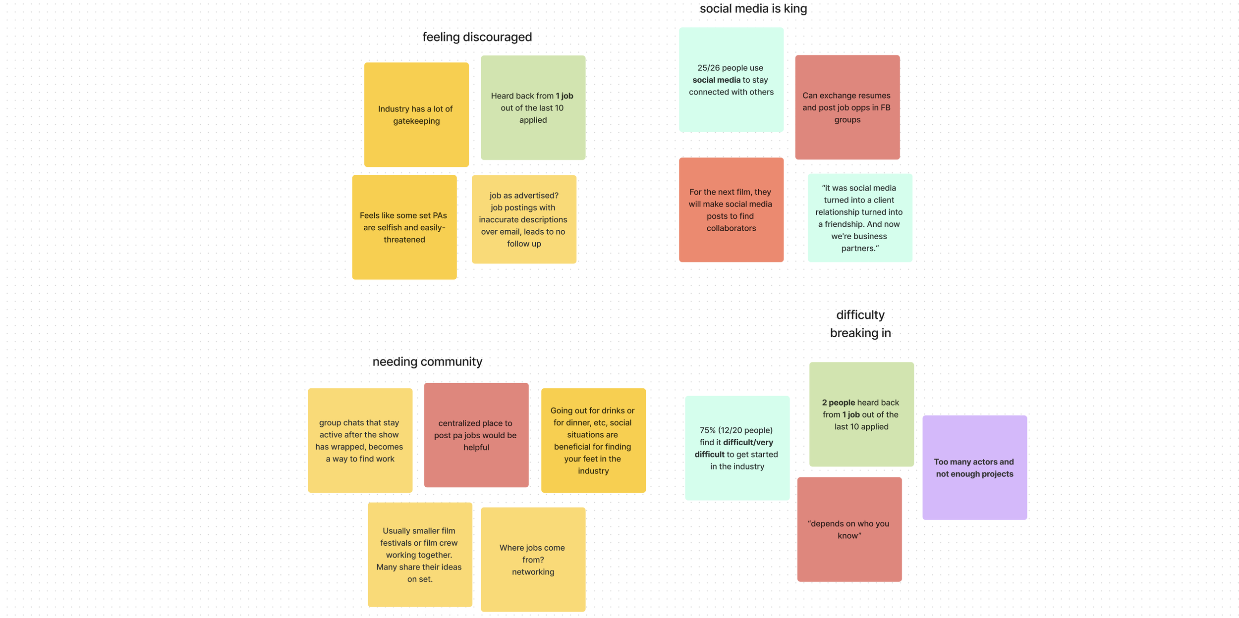
Affinity Map
Key Themes:
Social media, especially Facebook, is integral in the job hunting/hiring process in the Entertainment Industry
Need to know someone to break into the industry
Community has a major role in finding work
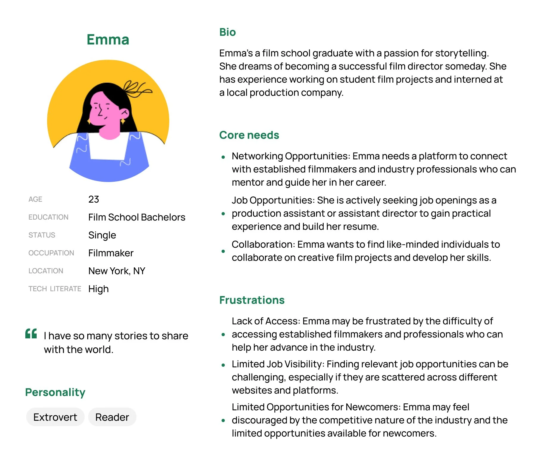
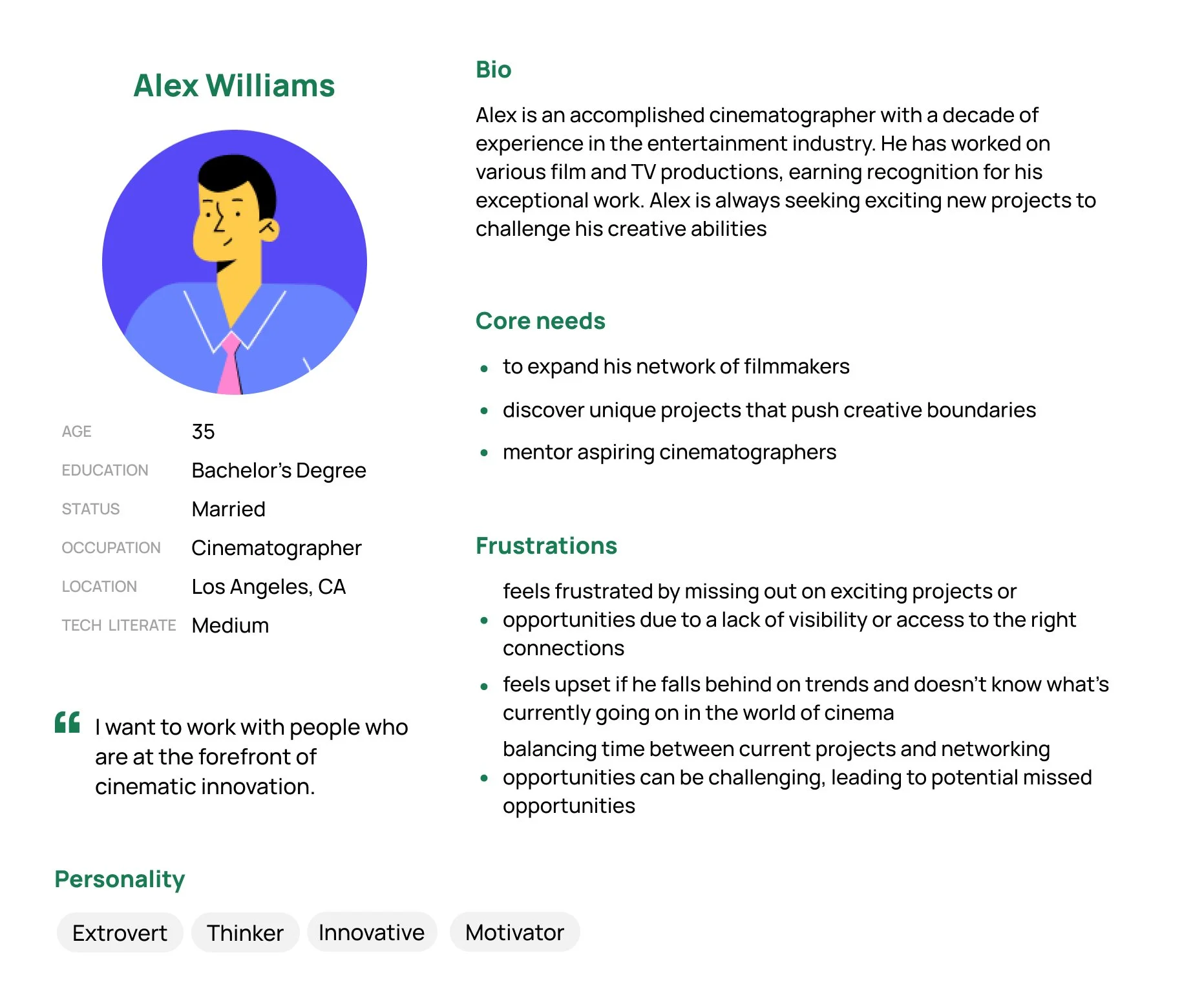
User Personas
The App
Along the way we had trouble figuring how best to navigate the app. Deciding to split it into three sections was essentially the result of the challenge of balancing and focusing our concepts. But how were we going to connect and intertwine the different sections?
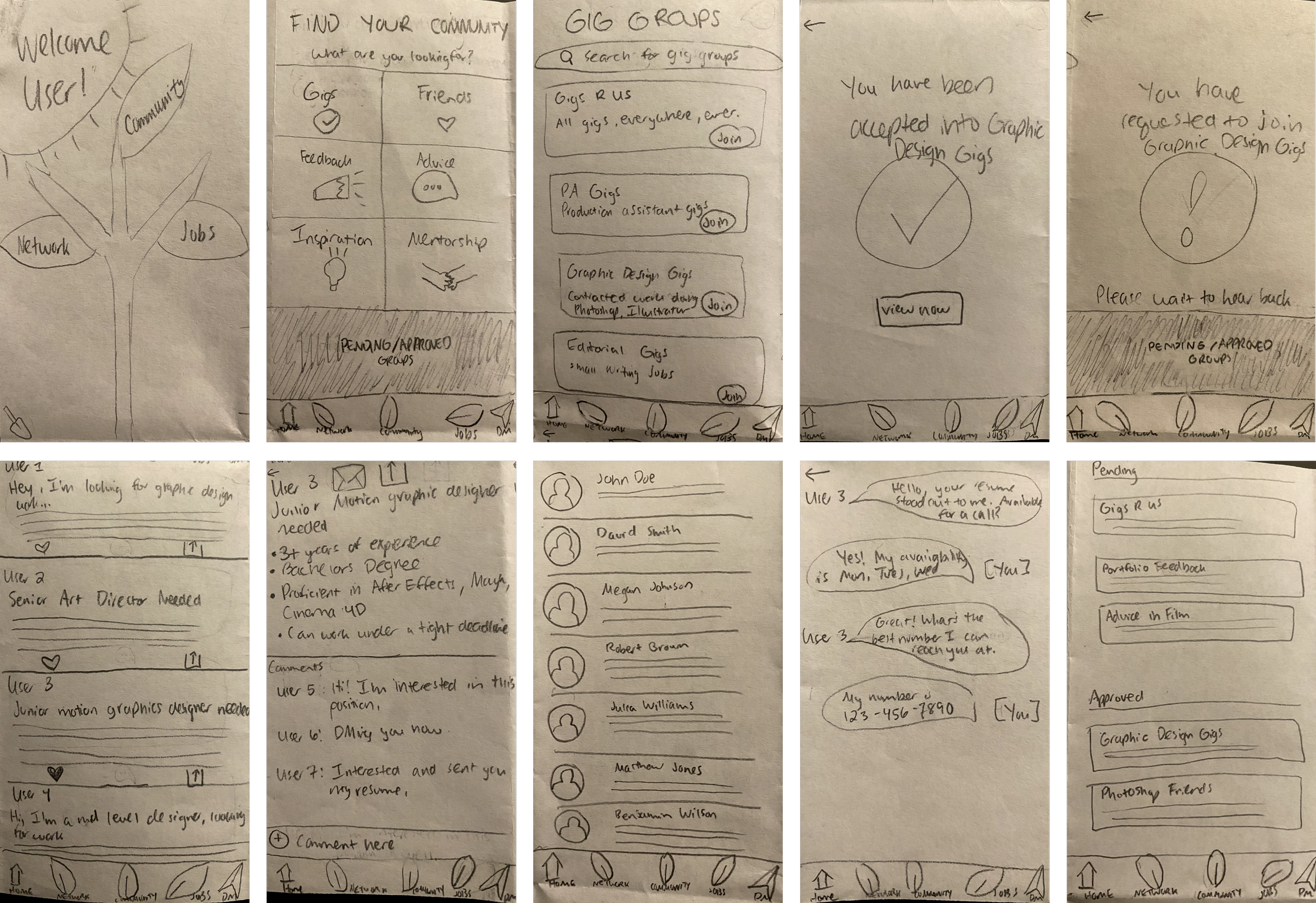
Paper Wireframe
User flow: In the Community View, the user joins a community group (called a collective) and looks through postings within that group.
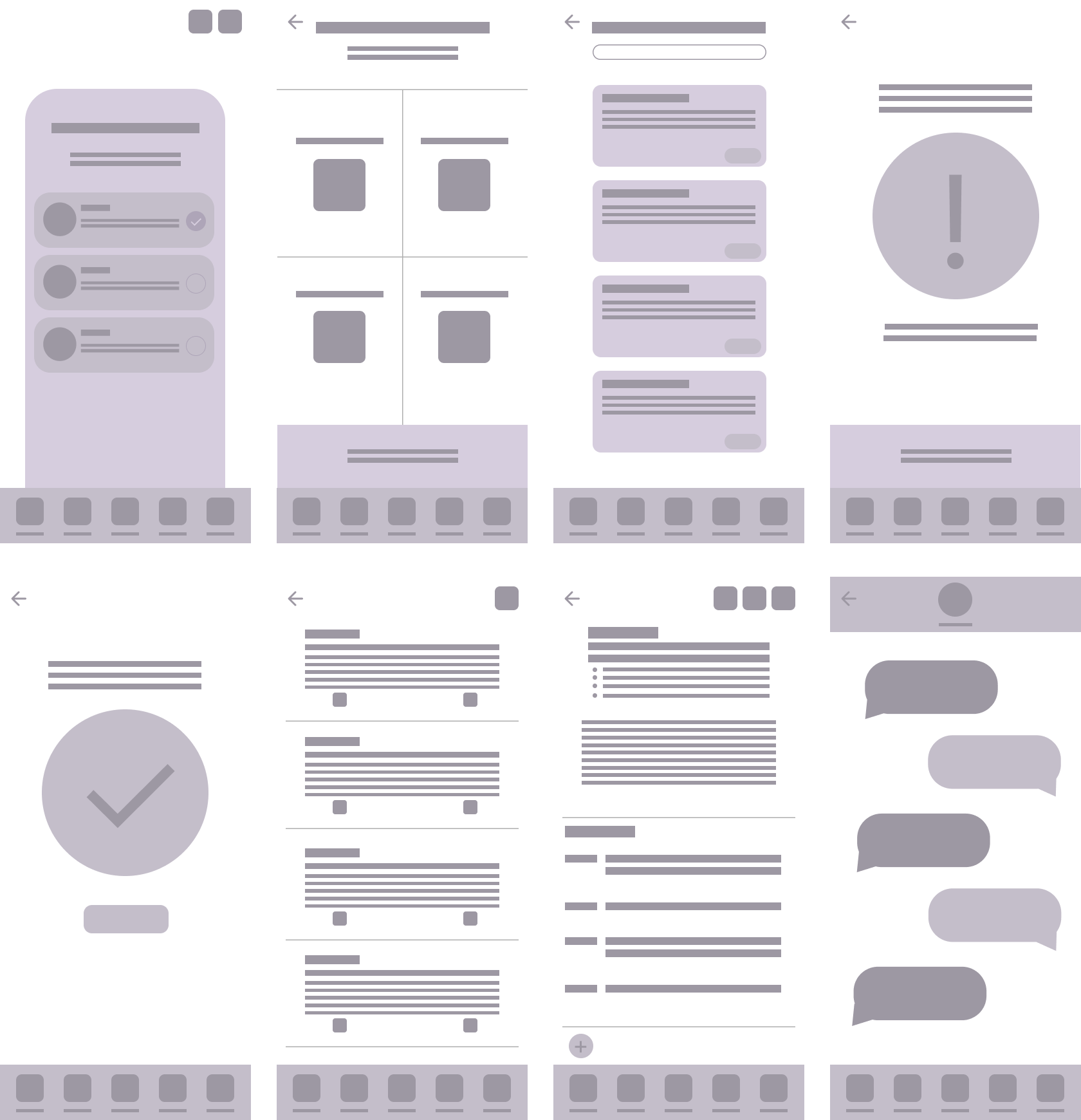
Low-Fidelity
Wireframe
Typography & Color
For the typography we chose Poppins, a clean minimalist Google typeface. This font was selected in order to help make the app’s features stand out. The colors we used are colors found in nature and are a tribute to our Industree name.

Opal Green #187C52
Medium Sea Green #3CAD70
Earthtone #61391D
Interface
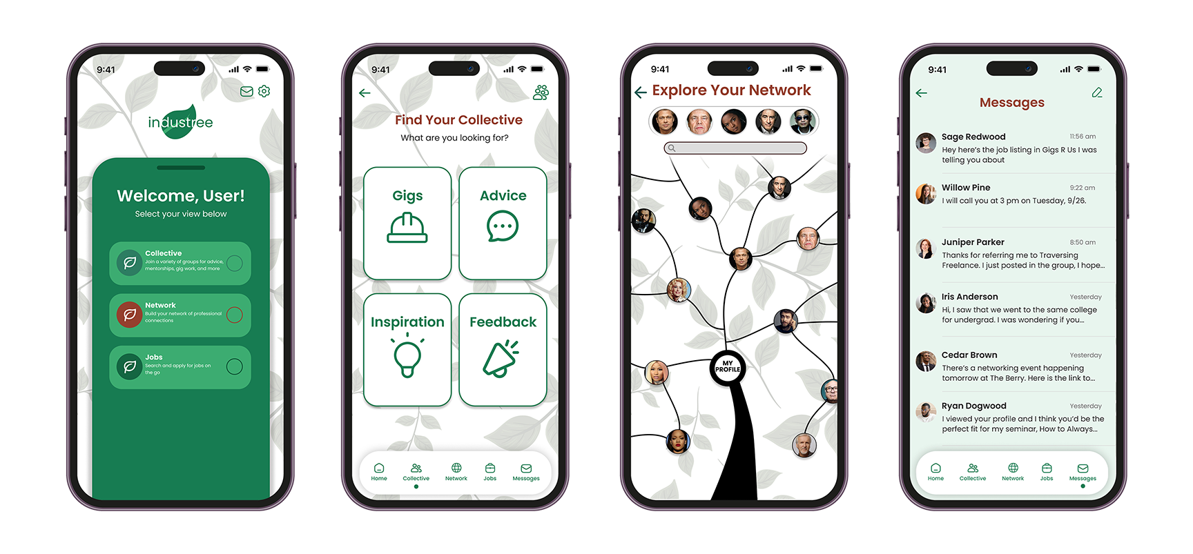
We designed a pop-up tab for the home screen that divides the app into three Views: Collective, Network, and Jobs.
Collective: A collection of communities where people can get feedback on their portfolios, seek advice in their careers, find gigs, or just get inspired.
Network: A way to manage contacts in the entertainment industry.
Jobs: A simplified job posting board to take the pain out of the job application process.
Navigation Bar

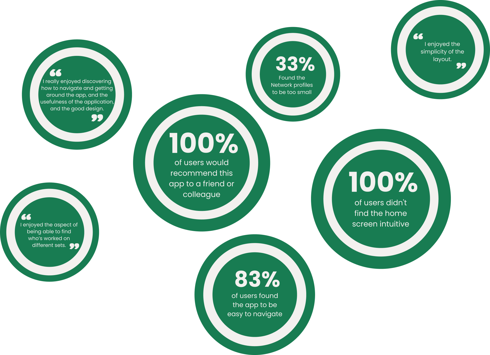
Participants couldn't figure out the exact steps of how to navigate to a View from the home screen. Participants suggest making the dedicated icon larger and/or put a label below.
When attempting to navigate to the approved and pending Collectives page, users first went to the homepage. Participants say the paper airplane icon we used means "send" to them, and not "to send a message". They suggest using a chat bubble icon instead.
When navigating to the direct messaging feature, users spent a long time searching for it. Participants suggest animating the home screen's tab pop up first to indicate that it should be pulled back down. Or to add text that tells the user to swipe down after making a selection
Usability Test Results
Key Findings
Challenges
The greatest challenge was seeing the Jobs portion of the app to completion. Unfortunately there was not enough time for it during the project’s timeline. We would like to continue building this out in future iterations of the app
Taking the feedback from the initial user surveys and turning it into a viable app - something that our users would actually want to use - was also quite challenging.
Challenges
Implementing the Jobs view
Reworking the home screen to be more intuitive
Refining the interactive Network Tree as it was a complex concept
Next Steps
Thank you!